For my front cover I used the convention layout of a dominate master head in a bold and eye catching font that conveys the genre and style of the magazine, in my case I used an eroded bold font to portray the edgy concept of STROBE.
When stylizing my artist, I focused on portray this image by getting inspiration from current artist in the industry who although embody a indie rock fashion image still appear glamorous and sexy. I created this look by using conventions used across the music magazine genre, messy bed head hair, bold blood-stained red lipstick, and edgy , on trend flesh bearing clothing, this coupled with high fashion bold body language and poses when posing for the photo shoot, for example the cover in with the artist will be biting a bunch of peals with a playful of aggressive facial express symbolizes that magazines combination of a rebellious, challenging concept interfusing with glamour and class, all of which aids in representing the fresh innovative and unique hybrid of genre and life style demography STROBE express'
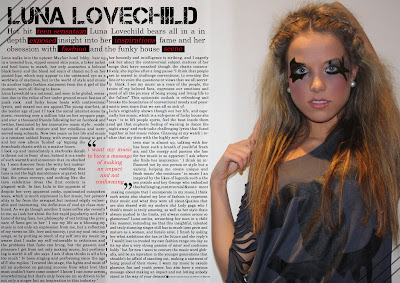
For my double page spread I followed the layout and concept of a edgy bold, making sure it follow through out – an important convention of a magazine, adding to the visual authenticity. I decided to take up a side of the page with a dominate photograph, conventional of fashion and music magazines alike as it attracts the reader when turning the page. I have created an interview in a colloquial, informal chatty tone to appeal to the teen target audience and the relax and down to earth personality of the artist. Instead of doing a convention music magazine interview layout of question and answer I have decided to incorporate a fashion magazine element in this by presenting the interview in a narrative form including information of the appearance of my artist to portray what she’s all about, it will feature 'access all area' topics will insightful and revealing information and quotes into the lifestyle of a fresh, unique and fashionable young new artist in the currant industry, which will appeal the to the exposed celebrity culture of the teen generation today.
 For my contents page I have used a variety of visual simulating images that together echo the overall ideologies of a fusion of hedonistic, pleasure seeking lifestyle demographic that exuded glamour, but also embodies a combination edgy, rebellious and anit authority feel that will widen the target audience. The layout of my contents page breaks conventions as my putting the writing central to the page it draws the eye in and mirrors that of a fashion magazine, which again widens the demographic for my magazine.

No comments:
Post a Comment